
Hi Scrappers!
I'm back with another layout for Sketchabilities... Like always, they have an amazing sketch to work from! I had another photo from the marriage of my parents, which is very vintage, I used that for my project. I tried to keep the colors quiet similar and matching and used therefore very soft and light colors like gray, pink and off-white. Here's my creation:
The picture is veeery vintage, like the one in my mixed media canvas some days ago. I didn't want to use the original, because it's in our family album and I didn't want to remove it from there. That's why I scanned it and printed it out with my ink-jet printer at home on some photo-paper. For the background I used different papers from DCWV from the lace and linen stack. I made the roses by myself using off-white cardstock and the roses creation dies by Donna Salazar. I covered the edges of the rose petals with stickles (icicle and frosted lace) to add some glitter.

On two corners of the background I used a Crafters Workshop mask and some silver modeling paste to make it more interesting. Besides, I inked all the edges with a Prima chalk ink (attic dust).
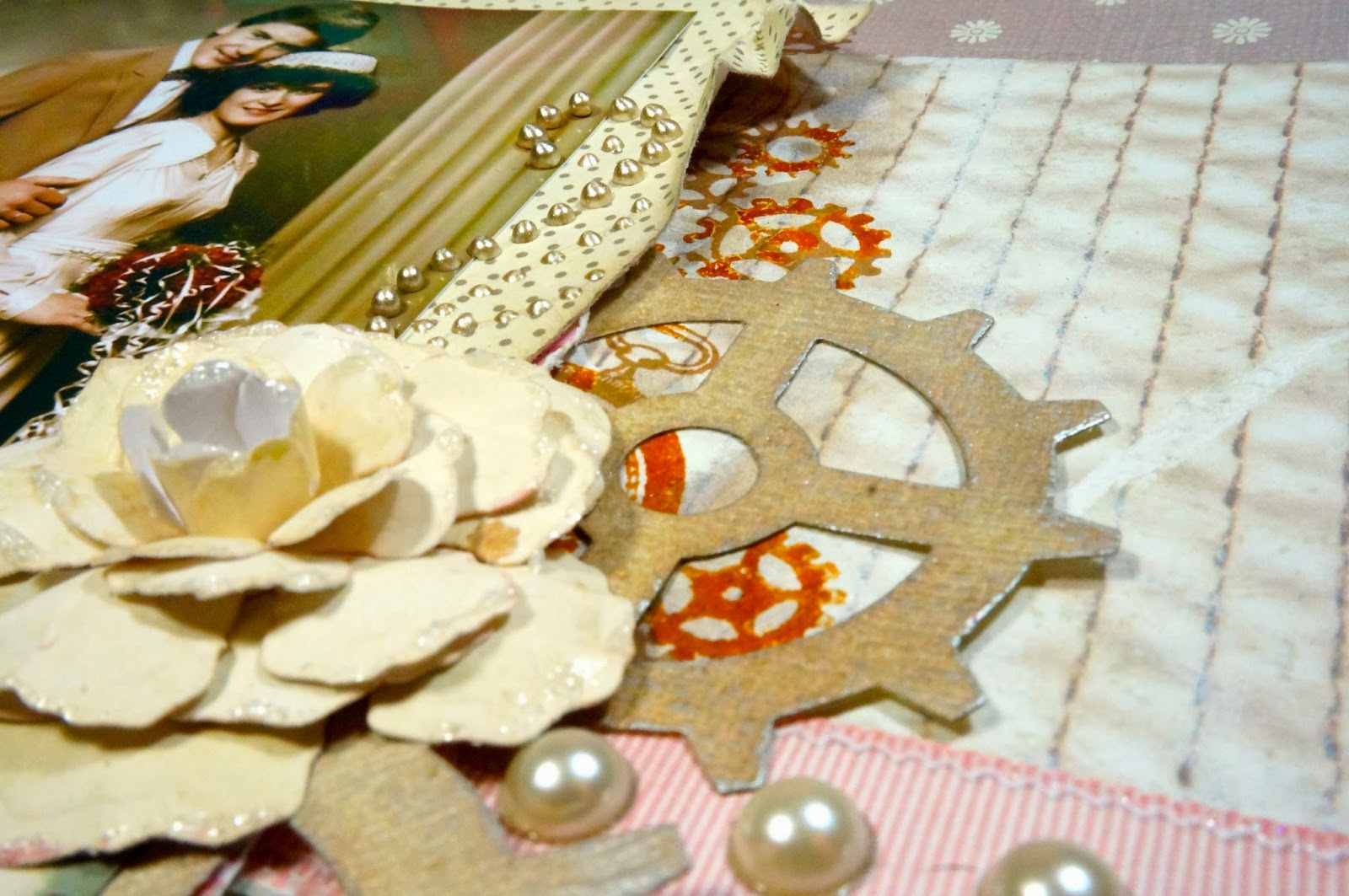
This time I did a lot of background work. You can't see it a lot because it's hiding a little bit behind the paper layers and the photo. First I used another mask from Crafters Workshop (gears) and applied some gesso with a sponge. This made a very soft background and you couldn't barely recognize the gears. I decided to apply another layer of paint, this time some distress ink (pumice stone) with the same mask. This created a cool look, since the gesso came out more and gave it a really layered look. After letting it dry, I stamped some gears and clocks with Adirondack sepia ink.

On some spots I stamped blotches with Versamark ink and added some distress embossing powder to it for more texture. For an even more distressed look I scratched some spots with the end of my Prima Marketing distressing tool. I applied some half-pearls on the "fake"-ribbon to give it more dimension (the ribbon is just a printed scrapbook-paper ;))

Here you can see my dictionary stamp by Kaisercraft at the background. I used again pumice stone distress ink, but applied it very uneven to create that worn look. For the "bling" I added some doodles with my platinum liquid pearl. I die-cut the gears from structured vanilla cardstock, inked it with pumice stone, misted it with perfect pearls mist (pewter) and rubbed on a little bit of Inka Gold (silver) with my fingers, to bring out the texture of the paper.
I wanted to add this layout to my current scrap-album, but after showing it to my parents, they wanted to keep it :) So I guess they'll hang it onto a wall like a painting ;) Well, no problem I'll create a new one.
That is the great sketch #106 I was inspired by:

Thanks for stopping by, and wishing you a great weekend!
So soft and beautiful!! No wonder your parents wanted to keep it!! Gorgeous!! Thanks for joining our challenge at Sketchabilities :)
ReplyDeleteSuch a beautiful and romantic layout! and a great background work too! Thank you for playi8ng with us at Sketchabilities!
ReplyDeleteBeautiful Layout!
ReplyDeleteGreat take on the sketch! Thanks for playing along at Sketchabilities!
ReplyDeleteI love the way your muted colour palette helps the vintage aspect of your picture. Very harmonious, I like it!
ReplyDeleteAwesome layout!! Glad you joined our challenge at Sketchabilities :)
ReplyDeleteGreat page! Love the gears w/the flowers! Thanks for playing along with sketch #106 at sketchabilities!
ReplyDelete