Monday, January 6, 2014

ScrapFriends sketch challenge #21

I'm so in the mood to scrap! I finished another sunny layout, which was inspired by a sketch challenge. It's the January challenge from Scrapfriends and it was a lot of fun to finish it. Just as some weeks ago I used bright yellows and greens for this layout. We had some nice sunshine today, maybe that's the reason why I wanted to use these colors :) The picture is from 2011, when I did my first hiking-tour with my best friend. We had a great day together and since this time, I really enjoy hiking and exploring nature! Besides, there isn't any missing "e" in my title, it's just the German word for nature ;) 


I used different techniques for the background: water-coloring, misting, masking with modeling paste and masking with distress ink. On two spots I stitched a circle with baker's twine and the frames behind the picture are made out of different ribbons.


This is their cool sketch for January:


Thanks for reading and wishing you a fabulous week :)


WW1 - Tangerine!

Another scrappy weekend is over, and I was working on another layout for a challenge. This one is for the White With 1 January challenge. It's about using white as your main color and adding another (fruity) one :) Well, orange isn't my color at all, so I thought this might be a good opportunity to use some of my orange stuff :) I used a picture from Christmas 2012, because there's a red filter on it and this matched quiet good with the tangerine. My layout hasn't really a Christmas feeling, but anyway it's more about how time runs and that this picture was taken over a year ago.


I die-cut the butterflies from a scrap and used it as a negative shape for the background, too. This way it looks like the butterflies just flew away from the paper and spread around the layout. 


To mark up my journaling I glued down some yarn. On the edges of the white background I stitched a little bit of orange floss in two different ways. 


I spritzed a little bit of orange twinkling H2O watercolor with my water-brush on the background to create a soft color-strip behind the butterflies. Behind the picture I stamped and embossed some different textures for a layered look. 


Thanks for stopping by!

Saturday, January 4, 2014

Sketchabilities #106 - Still in Love

Hi Scrappers!
I'm back with another layout for Sketchabilities... Like always, they have an amazing sketch to work from! I had another photo from the marriage of my parents, which is very vintage, I used that for my project. I tried to keep the colors quiet similar and matching and used therefore very soft and light colors like gray, pink and off-white. Here's my creation:


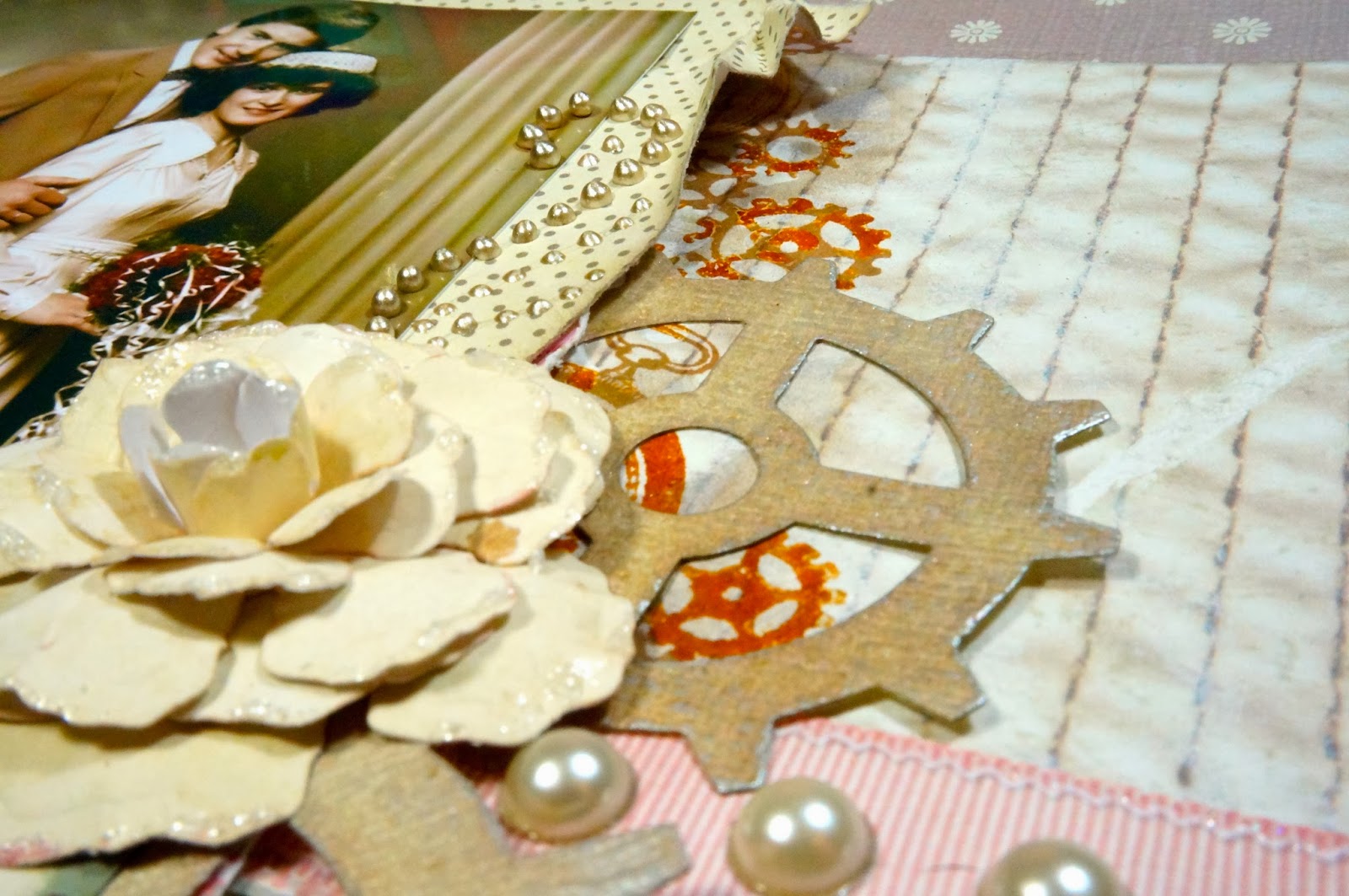
The picture is veeery vintage, like the one in my mixed media canvas some days ago. I didn't want to use the original, because it's in our family album and I didn't want to remove it from there. That's why I scanned it and printed it out with my ink-jet printer at home on some photo-paper. For the background I used different papers from DCWV from the lace and linen stack. I made the roses by myself using off-white cardstock and the roses creation dies by Donna Salazar. I covered the edges of the rose petals with stickles (icicle and frosted lace) to add some glitter. 


On two corners of the background I used a Crafters Workshop mask and some silver modeling paste to make it more interesting. Besides, I inked all the edges with a Prima chalk ink (attic dust). 


This time I did a lot of background work. You can't see it a lot because it's hiding a little bit behind the paper layers and the photo. First I used another mask from Crafters Workshop (gears) and applied some gesso with a sponge. This made a very soft background and you couldn't barely recognize the gears. I decided to apply another layer of paint, this time some distress ink (pumice stone) with the same mask. This created a cool look, since the gesso came out more and gave it a really layered look. After letting it dry, I stamped some gears and clocks with Adirondack sepia ink.


On some spots I stamped blotches with Versamark ink and added some distress embossing powder to it for more texture. For an even more distressed look I scratched some spots with the end of my Prima Marketing distressing tool. I applied some half-pearls on the "fake"-ribbon to give it more dimension (the ribbon is just a printed scrapbook-paper ;))


Here you can see my dictionary stamp by Kaisercraft at the background. I used again pumice stone distress ink, but applied it very uneven to create that worn look. For the "bling" I added some doodles with my platinum liquid pearl. I die-cut the gears from structured vanilla cardstock, inked it with pumice stone, misted it with perfect pearls mist (pewter) and rubbed on a little bit of Inka Gold (silver) with my fingers, to bring out the texture of the paper.

I wanted to add this layout to my current scrap-album, but after showing it to my parents, they wanted to keep it :) So I guess they'll hang it onto a wall like a painting ;) Well, no problem I'll create a new one. 

That is the great sketch #106 I was inspired by: 

Thanks for stopping by, and wishing you a great weekend! 


Thursday, January 2, 2014

Exciting News! Guestdesigner for Family and Friends

English version please see below :)

Für all die deutschsprachigen Besucher unter euch werde ich die Family and Friends Challenge Beiträge natürlich auch auf deutsch teilen. Ich freue mich wirklich sehr, als Gastdesigner von Januar bis April bei euch meine Bastel-Kreationen einstellen zu dürfen. Es ist das erste Mal, dass ich "gastdesignen" darf und freue mich riesig! Ich hoffe euch gefallen meine Werke und ich kann dem ein oder anderen von euch ein paar Inspirationen geben. Natürlich würde ich mich auch über regelmäßige Leser freuen :)  

I have some very exciting news to share with you! I am a guest designer for the German blog "Family and Friends". It's a challenge blog for all the crafters out there with nice prices to win. They have monthly challenges with different exercises, and I'll join them for four months, from January till April.
I am very happy about that, since it's my first chance to share my projects on a challenge blog with all the crafting people out there. Maybe I'll win some new followers this way, too. That would be awesome ;)


Für die Monatsaufgabe Januar "Lasst es schneien" habe ich mich für eine große Karte entschieden, die ich einer meiner Freundinnen geschenkt habe. Hierfür habe ich einen großen Tannenbaum gestanzt und eine Tasche aus Transparentpapier gefertigt. In diese Tasche habe ich dann weißes Konfetti in verschiedenen Größen eingefüllt, welches man wunderbar "schneien" lassen kann.

Anyway this months challenge is about "let it snow". Any project is welcome, as long as it matches the theme. I created a huge card for a friend of mine, with "snowflakes" behind some vellum. You can shake it and have some fun with it ;)


Außerdem habe ich einen wunderbar passenden Stempel auf etwas Transparentpapier hinzugefügt, und zwei kleine Schneeflocken links und rechts mit Prägepuder aufgebracht. 

I added a banner with a perfect matching stamp on some more vellum and used copper embossing powder to create two little snowflakes. 


Um das Transparentpapier herum habe ich mit mehrfarbigem Garn einen schönen Rahmen als Eyecatcher genäht. Außerdem hält das Garn das ganze Konfetti fest, da ich das Transparentpapier nicht festgeklebt habe. Das war's auch schon! Vielen Dank fürs Vorbeischauen, und ich hoffe euch nächsten Monat wieder zu sehen! Liebe Grüße, Moni

I used some multicolored yarn to stitch the vellum on the paper to give it more texture and to create an eye-catcher. And that's it! Thanks for reading and have a great day!


Wednesday, January 1, 2014

Scrap & Music #18 - Nothing Else Matters

Another beautiful sketch provided by Scrap & Music! This time they choose a song by Metallica - Nothing Else Matters. I took two photos from our holiday in Egypt. We were snorkeling a lot and took many pictures under water. Finally time to get some of them scrapped! Here's my take on their sketch:


I took different shades of green/blue and beige for the papers to match them with the pictures. I think they look a little bit like the color of the ocean. Behind the clustered papers I applied a layer of white crackle paint and covered it with a little bit of distress ink after it was dry. After that I spritzed a bit of different mists and sprays. 


At the edges of the banners I used a little bit of embossing powder to give it a more interesting texture. 


I had no more space for my journaling, that's why I decided to make a "hidden" pocket tag by making a cut behind some of the layers.


On this picture you can see the texture of the crackle paint.


As title, I took the "life is ours" lyrics from the song.


And this is the sketch I based my LO on: 


Thanks for stopping by :) 

Mixed Media Canvas - My married parents

Happy New Year Scrappers!

I thought it's time to create a new mixed media canvas. I haven't used any pictures of my parents and this time I wanted to use a very special photo of them. Isn't this vintage? I got some happy news: I booked a scrap-event with Finnabair in February!!! I'm a huge fan of her work, as you can see, my project is very much inspired by her style. I'm so excited to have a weekend participating in her workshops. After watching some YouTube videos on how to create a mixed media canvas, I gave it another try and this is the finished project: 


I used a lot of different techniques, but mainly: masking, misting and rubbing on some Inka Gold in different colors. 
These are the main steps I used to create the canvas:
1. Here and there I glued down some torn up paper pieces from an old book and covered them lightly with gesso. 
2. After letting it dry, I used two different masks with molding paste.
3. Then I figured out, which elements and which title I wanted to have on my project and glued them down. I used a lot of different items: wood veneers (gears), metal embellishments (i.e. keys, spoons, screws, keyholes...), prima flowers, lace trim and buttons. The small letters are from Maya Road, the larger ones made of grunge board from the Tim Holtz Collection. 
4. Again I let everything dry and covered it with another layer of gesso. 
5. After it dried, I sprayed everything with different matching shades of glimmer and metallic mists. Before I started misting, I covered the photo with a piece of plastic sheet. 
6. Then I rubbed on some Inka Gold with my fingers on every item, to give it a metallic finish. I used the colors: copper, hematite and metallic pink. 
7. Last but not least, I applied some accents with liquid pearls on certain spots.


These butterflies are plain chipboard, which I covered with embossing powder, heated it and then pushed into a stamp while the powder was still quite hot. 


Thanks for reading and a happy 2014! 

Friday, December 27, 2013

Scrap & Music - Challenge #17

Some days ago I found another challenge-blog by browsing through other people's scrap-blogs. It's  the Scrap & Music challenge blog and it provides BEAUTIFUL sketches! The twist of their challenges is about using a part of a song as title or journaling. In this case the song was "like a prayer" by Madonna. I really like this idea, and I think I'm going to join some more of their challenges in future :) Here I joined a color challenge from Sketchy Colors #191, too. It's about using white and gold in your project. So here's my inspiration for the layout:


 and that's what I created: 


I'm a little bit unhappy with the colors of the picture I took of the layout, because it just couldn't catch the right colors. The white was either too grey or too yellow, or the gold is way too dark. Anyway, although this is a rather "clean" layout, I used a lot of different techniques for the background. On some spots I used golden molding paste with a mask, on some other spots I used different shades of golden embossing powder and some golden perfect pearls.  


I grabbed my glittered die-cuts and gave the rose a golden finish. 


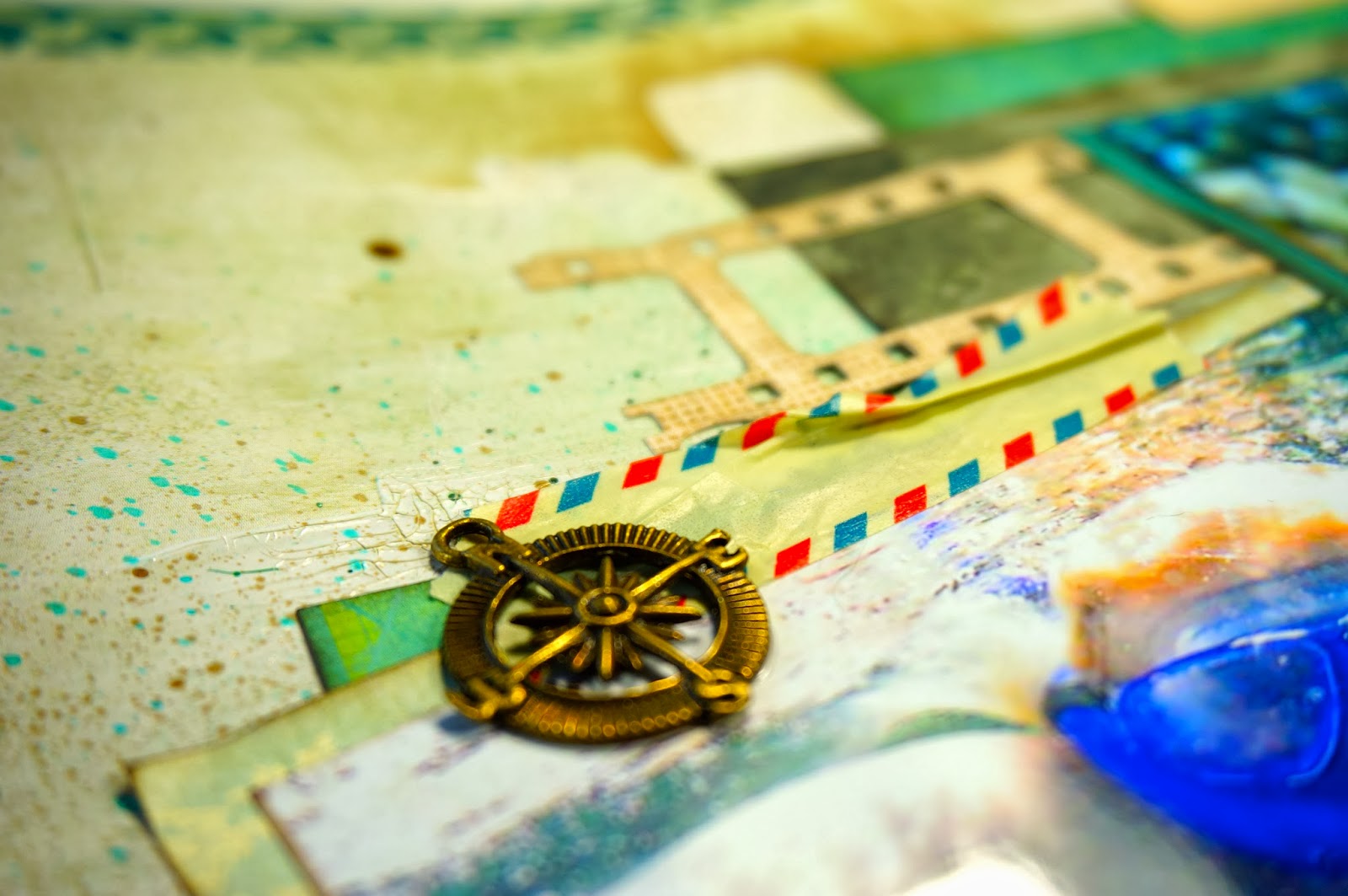
I made the big filmstrip by myself out of a piece of scrap-paper and added some holes with my crop-a-dile. The gear looks like a film roll and matches quiet good with the rest of the layout.


The banner-pieces and the ticket are cut from different embossed and glittered golden papers.  


The beginning of the title is written with liquid pearl color.


Thank you so much for stopping by and wishing you a fabulous weekend! 

Thursday, December 26, 2013

Scrap your travels - Switzerland

Hey Scrappers, during the holidays I had some more free time for being creative, so I joined another sketch challenge, this time from My Creative Sketches. Since I have a lot of pictures from our travels this year, I wanted to use one of these photos. I decided to take one from Switzerland, where we were hiking during the summer. The mountains are wonderful and we had a great time there. Here's what I created:


I used mainly two papers from the Heidi Swapp Vintage Chic collection and distressed all the edges. I applied some gesso and some molding paste on the background paper to make the front more pop and to add some contrast, since the colors of the papers are quiet similar.


these teal thickers matched just perfectly with the background and the picture.


I added here and there some tickets and travel embellishment.


I stitched down the brown paper by hand with some aqua thread.


The film strip is a die-cut from Tim Holtz. I glued an old hiking-map behind it and added some journaling on top of it. 

This is the sketch my layout relies on:

Thanks for watching!


Wednesday, December 25, 2013

Christmas 2013 - Sketchabilities # 105

A very merry Christmas to you all! 
We had a fabulous day together with the family and a great meal. Just scrapped our decorated living room in the latest sketchabilties #105. Here's my take on their beautiful sketch:


I wanted to use some classic Christmas colors (green and red) and mix it with a rather unconventional color (black/grey). I used some fine red glitter to make it even more festive. On the background I used some black gesso with a flourish mask and sprayed some glimmer green over that. 


For the banner I used three different green papers and layered them. On top of them I used liquid pearls (avocado) and distress stickles (shabby shutters).


I covered the wooden snowflakes with my "lime" Maya Metallic mist and added some glittered brads.


That's their sketch #105:

Wishing all of you a merry christmas and some blessed days :) 
Thanks for stopping by and have some happy holidays!