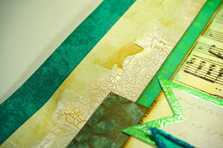
I took different shades of green/blue and beige for the papers to match them with the pictures. I think they look a little bit like the color of the ocean. Behind the clustered papers I applied a layer of white crackle paint and covered it with a little bit of distress ink after it was dry. After that I spritzed a bit of different mists and sprays.
At the edges of the banners I used a little bit of embossing powder to give it a more interesting texture.

I had no more space for my journaling, that's why I decided to make a "hidden" pocket tag by making a cut behind some of the layers.
On this picture you can see the texture of the crackle paint.
As title, I took the "life is ours" lyrics from the song.
And this is the sketch I based my LO on:
Thanks for stopping by :)


Great take on the sketch! Love the variety of techniques used throughout. Great effect with the crackle paint. Thanks for joining in at Scrap & Music!
ReplyDeleteGreat colors and photos!
ReplyDeleteLove your take on the sketch! I also really love the title you chose to go with your photos! Thanks for joining us @Scrap&Music!
ReplyDeleteWhat awesome pictures on an awesome layout! Thank you for joining us at Scrap & Music!
ReplyDelete